

Hi, I’m Jocelyn
I was born in 1999, and I’m in my final year of Uni. I’m studying Bachelor of Design in Visual Communication at The University of Technology Sydney.
Visual Communication Design focused on communicating with clients and customers through any visuals means available. Naturally drawn to express my world through visual arts and vivid imaginations, I always see metaphors and hidden meanings in my work. My work pursues connections to emotions and user experiences. I am an emphatic idealist who loves to use insights and creativity to help others solve their inquiries. I am currently working as a web designer for my part-time job.
I am interested in UX/UI design, Web Design, Motion, and Branding.
My Projects:
A Series of Book Cover
(Being a Beast, H is for Hawk, Island Home)
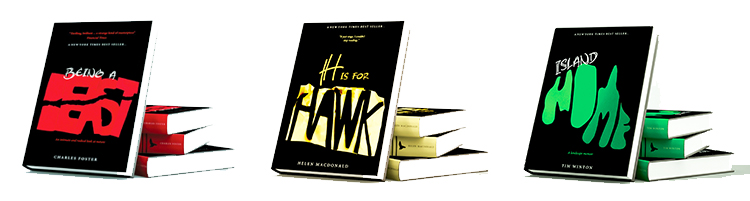
These were a university project, and I should make sure that I visually designed the book to represent a series. “Being a beast” is a story about a man who started living like animals and mimicking them. “Being a Hawk” tells a story about the author is being captivated by hawk since childhood. Last, Island home is about someone who is searching for a home and migrate from the UK to Australia.
I used the paper engineering concept for my book cover ideas. Beast in “Red” colour represents power and strength. The words is ripped-off to express the idea of Beast. Next, the concept behind the word “Hawk” is a birds nest. The paper is crumpled to represent the idea of being “captivated.” Last, The word home is created based on the Australia map. It conveys the idea “searching from home” in Australia. You must be wondering why I choose Green colour? Since Green represents the colour of an island.
I love how the final results came out, and the strong concept behind this idea. So, this is one of my favourite projects from Uni so far.
LAB A – FUTURING
(I did not show everything since this is group work. However, I will show the work that I did) This subject asks us to do some scholar research and predict how the technology will be in the future.
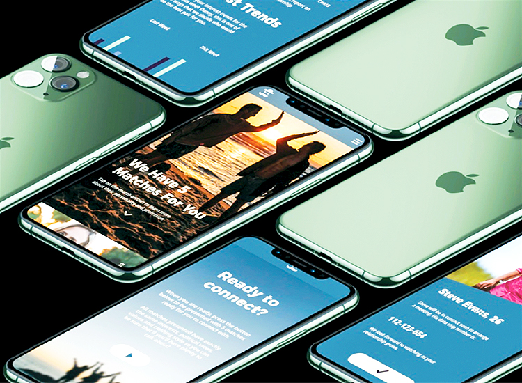
This is an app called the perfect match. It represents how dating app will be like in the future. Probably, eight years from today. It is 1/5 part of the assignment. (the other 4/5 is my group mate’s work, our group consisted of 5 people). My teammates and I are responsible for designing different things. They designed how travel apps, food apps will be like in the future, etc.
So, I designed how dating apps will be like in the future. Since the technology has been advancing, We predict that people will start to use chip number instead of photo ID. The chip number for everyone is different. They may begin to have the chip implant on your wrist.
Google homes and Alexa have been widely used in 2019. The technology started to recognise your identity, your voice, your personal information. This idea might be much stronger in the future, and eight years will change a lot. So, the chip will recognise your daily activities, your trends, your hobbies, and will arrange you to match with someone that is in the same circle as you (so you can talk lots of things since you share the same interest). This idea shows how personal privacy decreased as the year goes by.
You can experience the app that my team and I design:
https://xd.adobe.com/view/0d1e7773-77ef-46f8-668e-99016ae6c575-7b2f/?fullscreen&hints=off
(Jack, Kayla, Sheerena, Emma, and Jocelyn).
Then and Now – Illustrations
(Comparisons of how technology back then and today).
This booklet consisted in total of 25 comparisons of technology back then and today. I use brown colour to expresses “old” and red for “new”. However, I will show five illustrations comparisons. Please let me know if you have some feedback for me.
For more designs and inquires,
Please contact me through Instagram: @designbyjoce
Thank You for reading, I appreciate that. [IM]


